
THE CHALLENGE
What problems are we solving with this branding project?
Arta Grafică has over 100 years of history and is today one of Romania’s largest industrial printing companies.
It already had something many brands spend years trying to build, without fully expressing it: a strong foundation. A rich history, a team of experts built over time, technology, discipline, and a deep connection to print and the written word.
Our challenge was to bring this foundation to the surface and build an identity capable of naturally connecting past, present and future: more than a century of experience with today’s industrial and technological capabilities.
Because beyond production, paper, writing and printed matter remain deeply human. Things we touch, keep, and through which ideas move forward.
THE SOLUTION
What is the best approach for the brand?
The solution came, to a large extent, from within the company. From its people.
We worked closely with the Arta Grafică team and, together, identified the values that have sustained the company over time, beyond changes in ownership, technology or economic context.
Christian Derveloy, the entrepreneur who took over the company in 1993, captured very simply what we were also discovering throughout the process: “I invested in Arta Grafică because it was the best printing house in Romania.”
From there, we built the brand around what was already true.

THE LOGO
The symbolism behind the logo
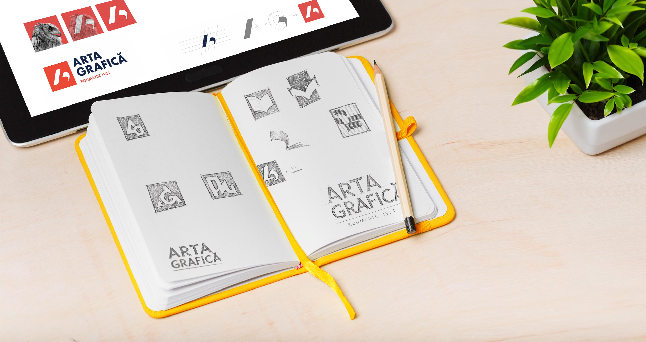
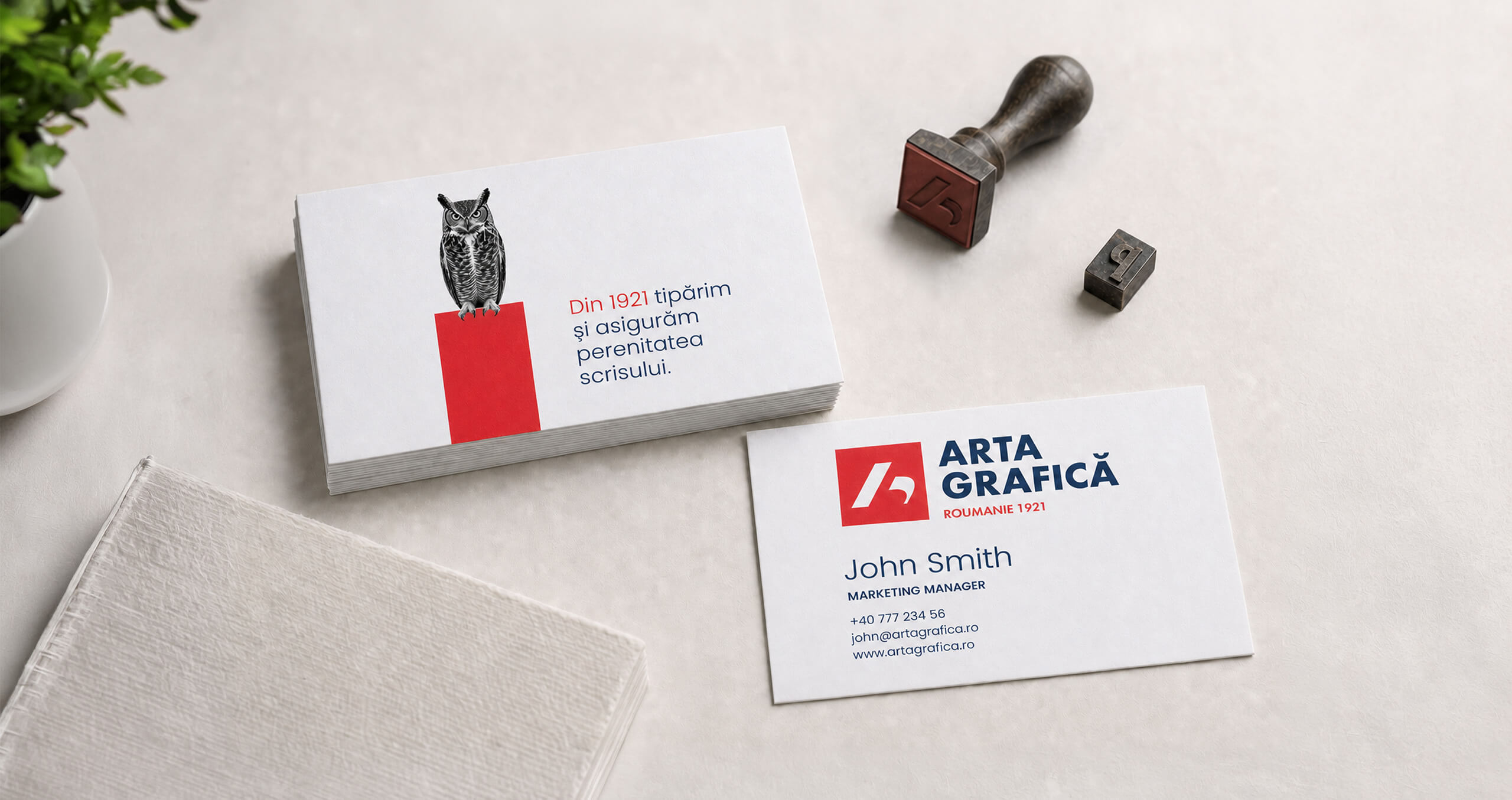
The Arta Grafică logo brings together printing heritage, technical precision and a contemporary visual identity.
Dark blue conveys professionalism and trust, while red introduces energy, creativity and visual impact.
The “ROUMANIE 1921” signature carries a distinct historical and identity role. Using the French name for Romania references the company’s Franco-Romanian dimension and the period of modernisation that began with privatisation and French investment.
The year 1921 marks the origin of the brand and anchors more than a century of printing history.
Beyond the brand initials, the geometry of the monogram also reveals the stylised profile of an owl.
This resemblance creates a natural connection between the logo and the owl, one of the central key visuals of the Arta Grafică identity.
Dincolo de inițialele brandului, geometria monogramei este profilul stilizat al unei bufnițe.
Această asemănare creează o legătură naturală între logo și bufniță, key visual central al identității Arta Grafică.
KYE VISUAL ELEMENTS

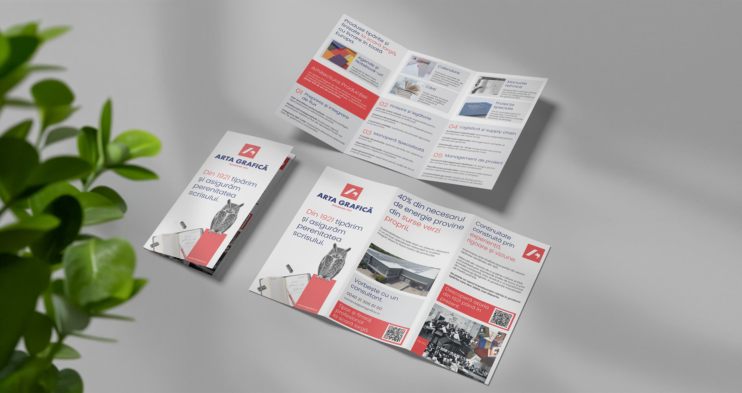
The collages are built from a limited number of simple, carefully selected and easily recognisable elements.
They create a coherent link between past, present and evolution, while preserving the brand’s minimalist, editorial and distinctive character.
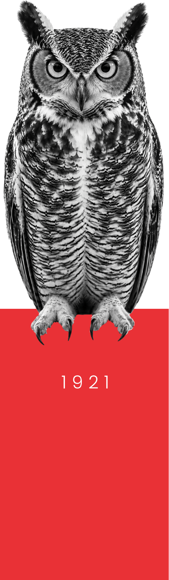
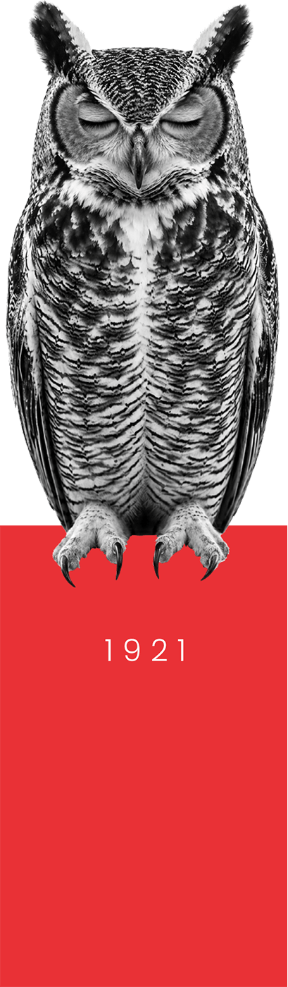
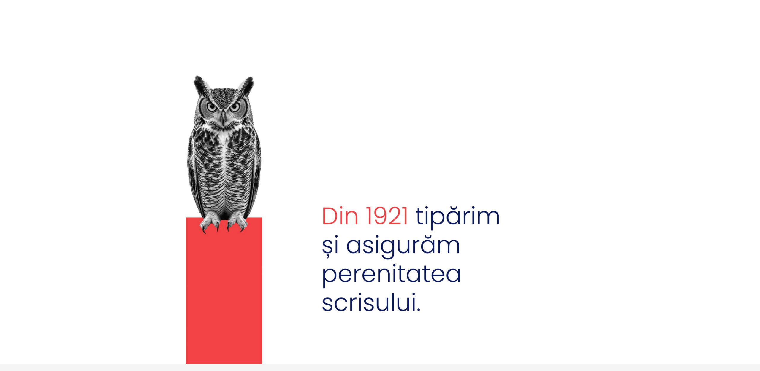
The owl is one of the defining elements of the visual identity.
A symbol of knowledge, wisdom and vigilance, it reflects more than a century of accumulated experience, attention to detail and respect for written culture.
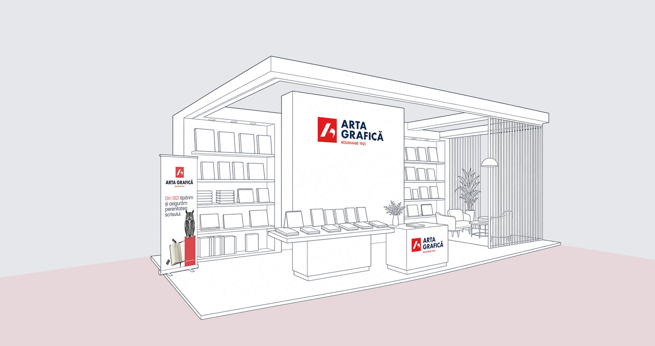
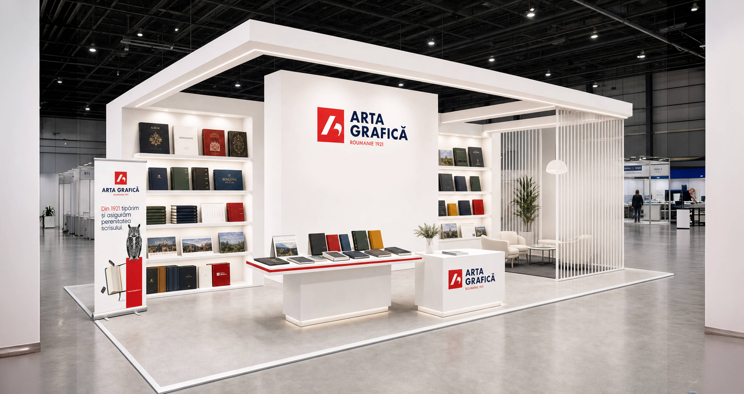
From monograph to dynamic historical line
We traced a thread of continuity through more than a century of transformations, challenges and investments, including the moment when French involvement made it possible for the printing house to continue and modernise.
In the Arta Grafică monographs, carefully researched and compiled by the internal team, we discovered a history far richer than what could be seen from the outside.
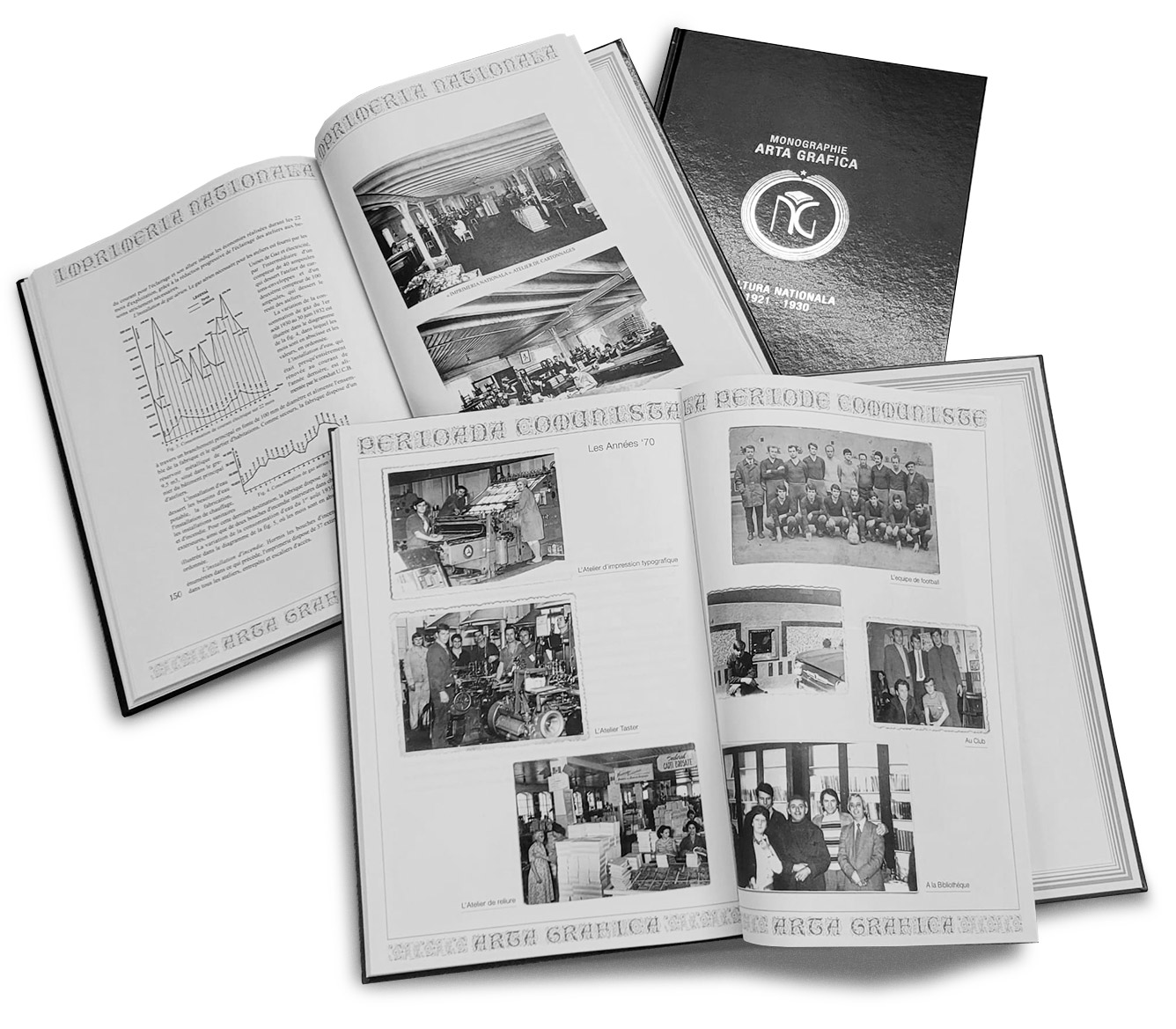
We went through documents, images and defining moments in the company’s evolution and transformed them into a timeline that shows Arta Grafică’s continuity through more than a century of change.
Going through the monographs, we came across names and works that genuinely delighted us: Homer’s Iliad, Baudelaire, the Luchian album, the Encyclopedia of Romania, publications of the Romanian Academy, art books and luxury editions.
Part of the culture we now find in libraries literally passed through the workshops of Arta Grafică.
VIDEO PRODUCTION
We created a brand film showcasing Arta Grafică’s industrial production capabilities, modern equipment and specialised team. The film was designed to support the brand vision:
“To strengthen our leadership position in the development of customisable products in Romania and become a trusted benchmark in printing production internationally.”
Techniques used:
- Aerial drone footage – DJI
- Filming with Samsung Galaxy S26
- Video editing

BRAND ARCHITECTURE
The EGO sub-brand
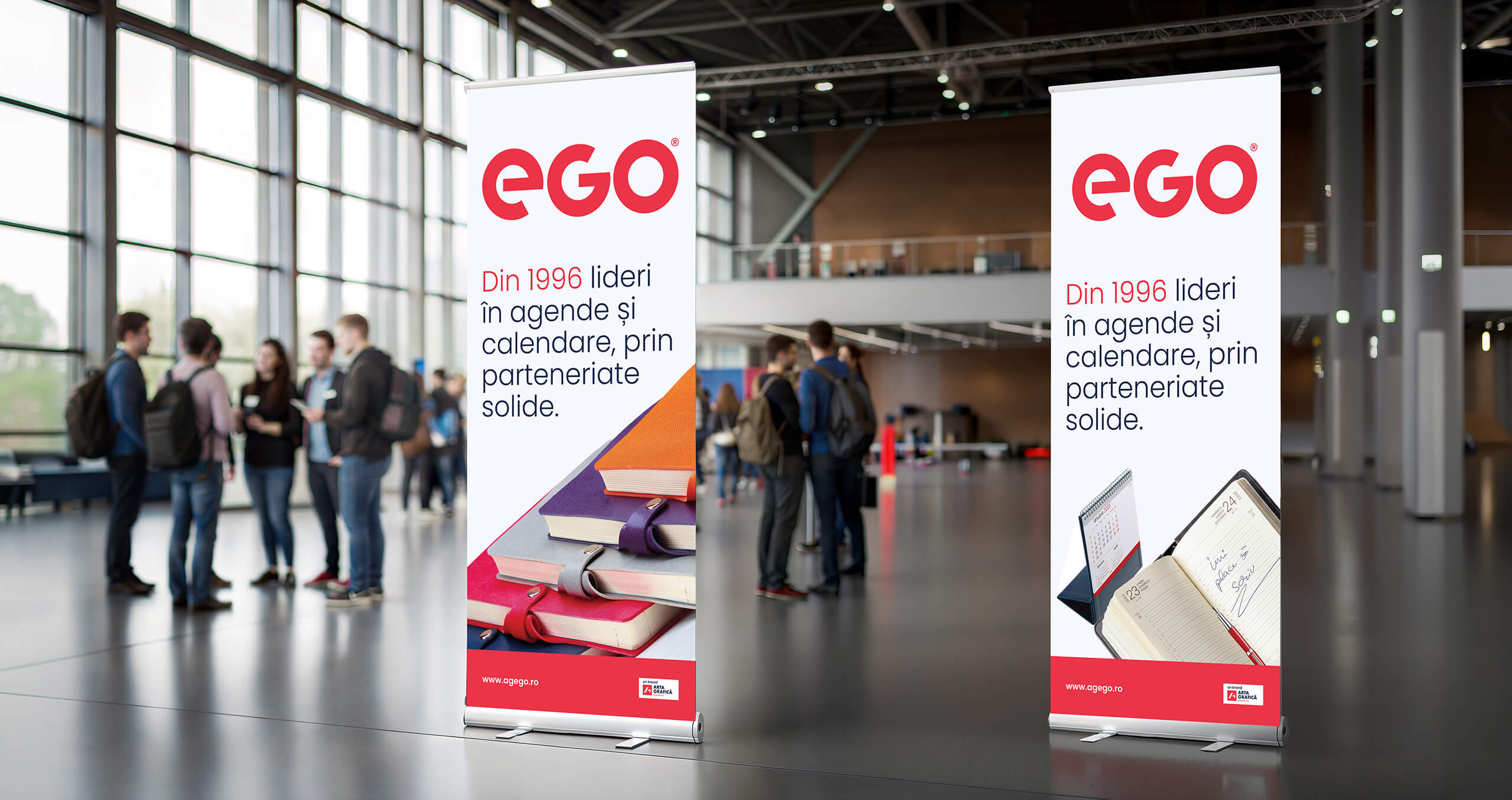
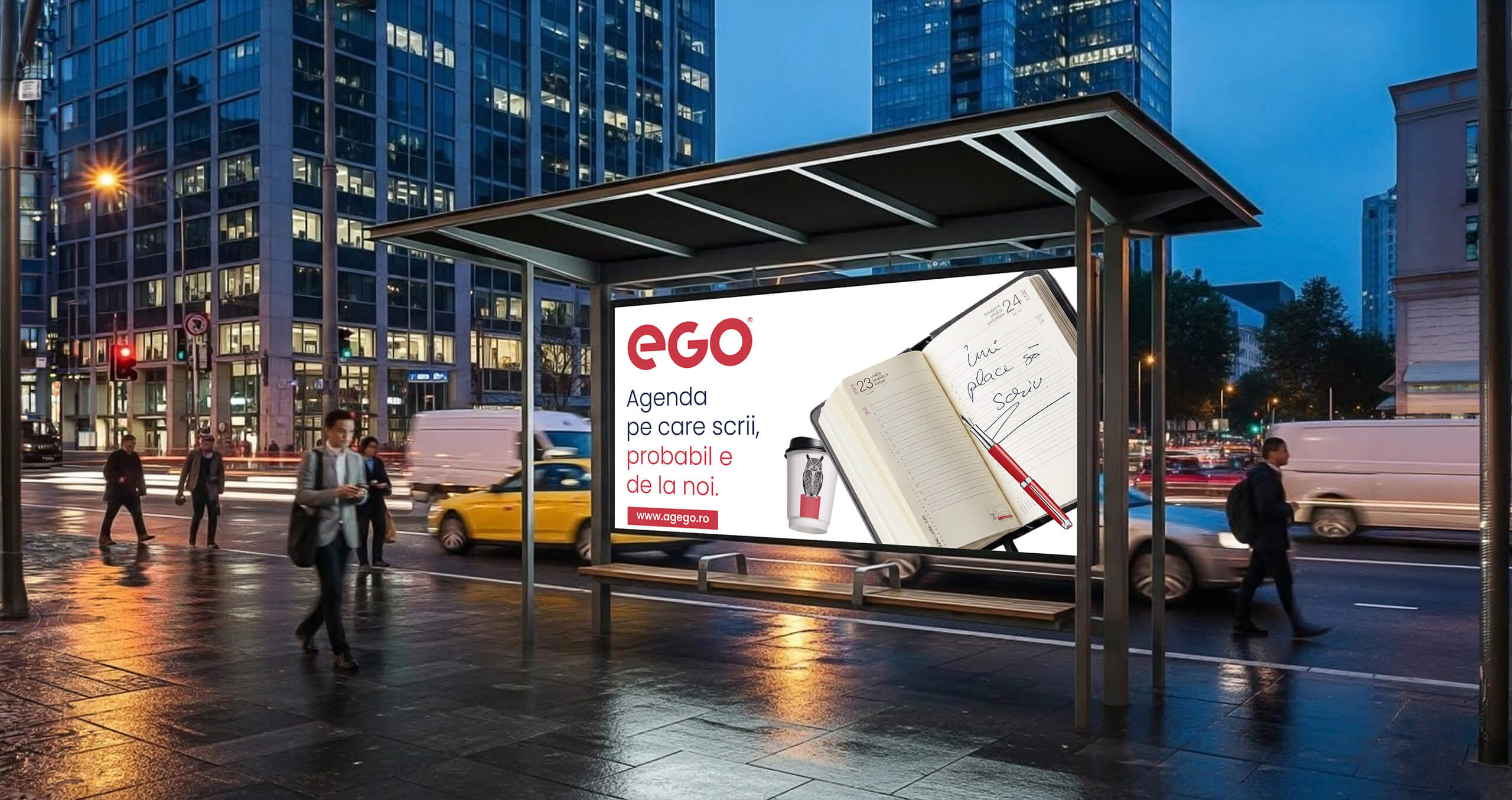
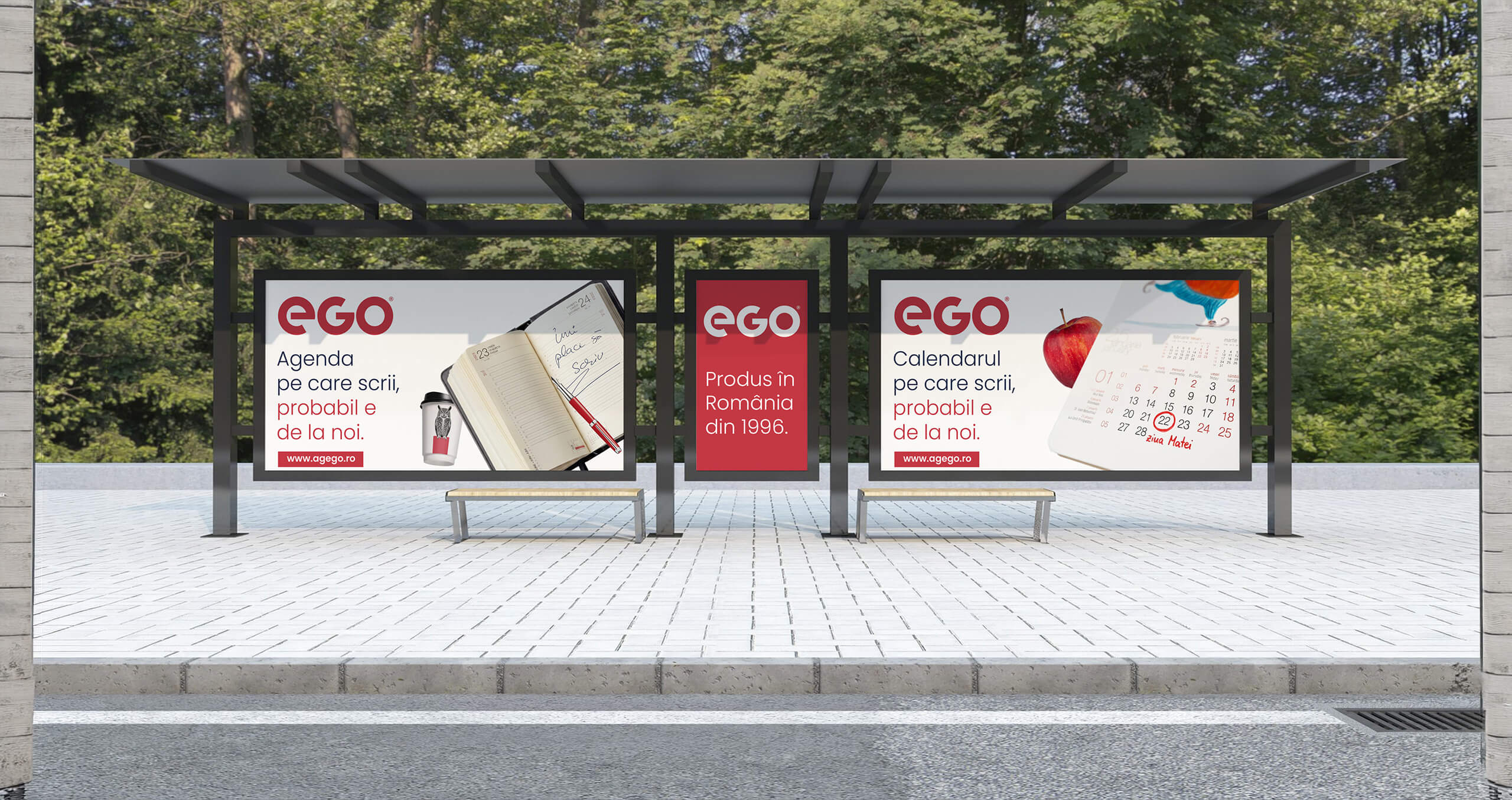
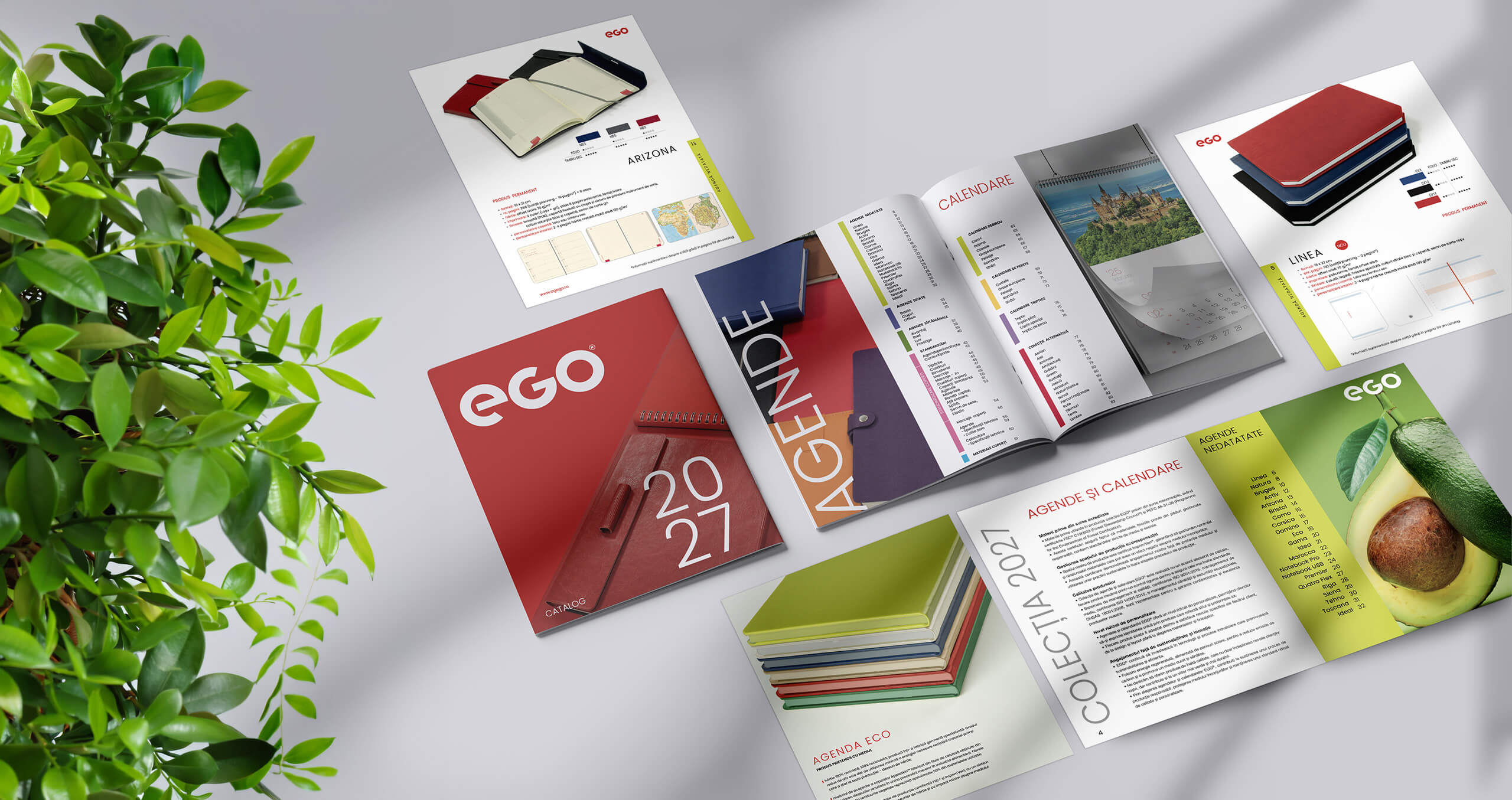
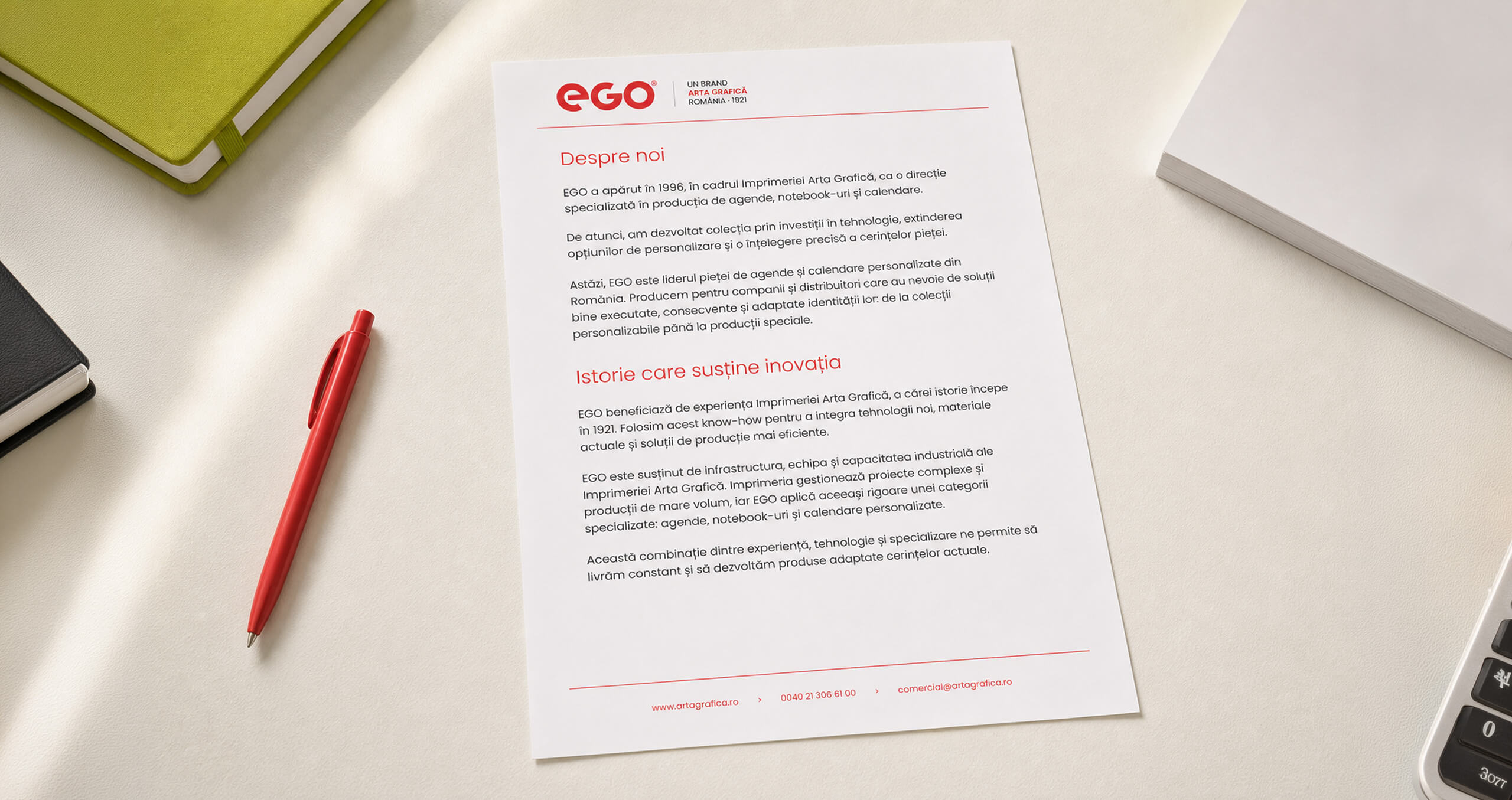
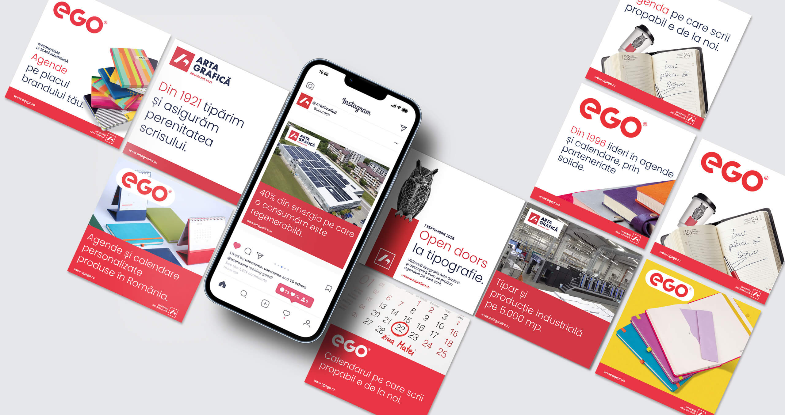
EGO has been part of the Arta Grafică story since 1996 and is today the Romanian market leader in personalised planners and calendars.
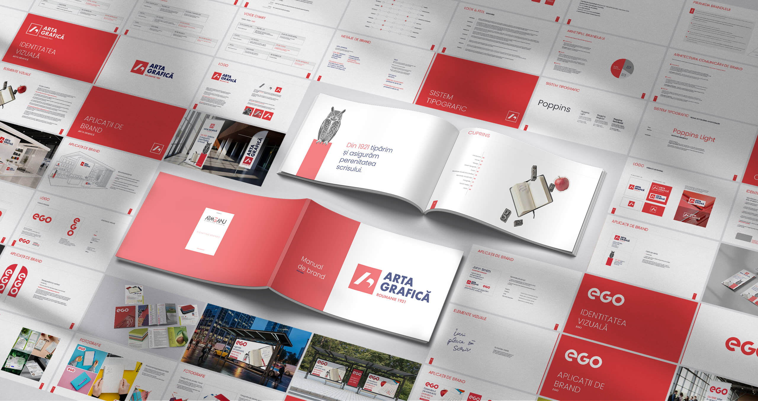
During the rebranding process, our role was to clarify the relationship between the two brands and build an architecture that allows them to work together without losing their individual personalities.
Arta Grafică remains the masterbrand, built on more than a century of experience in printing and industrial production. EGO brings this expertise into a distinct category, with its own audience, products and a more direct, commercial voice.
They share the same infrastructure, technology and expertise, but each brand has a clearly defined role.
We therefore maintained EGO as an Arta Grafică sub-brand while giving it a clearer personality and place within the system.
The result is a simple brand architecture: a masterbrand that carries the company’s reputation and industrial capabilities, and a specialised sub-brand that is already a leader in its category.