
THE CHALLENGE
What problems are we solving with this branding project?
The transformation of a personal brand into a mature, scalable, and memorable educational brand was the central challenge of this branding project for SAM – Metamorfoza Acting School.
The founder, Mădălina Mărcuș, had already succeeded in building trust, reputation, and an authentic relationship with both children and parents over time. But the next step was no longer about a single person. It was about building a school: with its own space, performance stage, team of trainers, community, and a long-term vision.
Our challenge was to deeply understand the internal culture of the team and the human energy behind the project. The strategic workshop was conducted together with the trainers, and one of the most difficult stages was selection. There was no lack of values, quite the opposite: there were too many beautiful, authentic, and meaningful ones.
We had to decide what deserved to be placed in the spotlight and what would remain in the background.
Another challenge was differentiation in a crowded market, where many acting schools communicate similar promises. For SAM, it was essential to build a distinctive, credible, and emotionally relevant identity, free from theatrical clichés or predictable formulas.
The brand needed to communicate empathy, structure, creativity, and professionalism at the same time. That rare and remarkable balance between artistic freedom and a sense of safety.
At the same time, the project also required strategic objectivity.
Being personally familiar with the world of amateur acting classes (Ana herself performs in amateur theatre productions), the process required separating personal experience from strategic business decisions.
Our role was to navigate clearly between emotion and strategy.
Video: Watch the creation process
THE SOLUTION
What is the best approach for the brand?
AWe built for SAM a brand strategy grounded in an essential balance: empathy, trust, and professionalism.
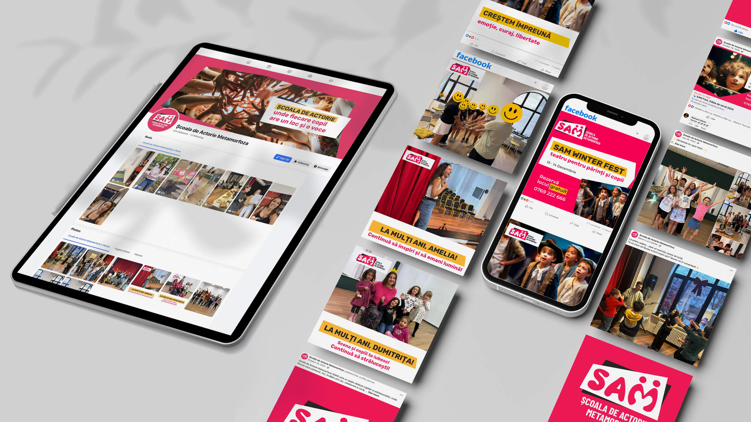
The brand voice reflects the spirit of the entire SAM team: warmth, encouragement, optimism, and energy, supported by structure and educational seriousness.
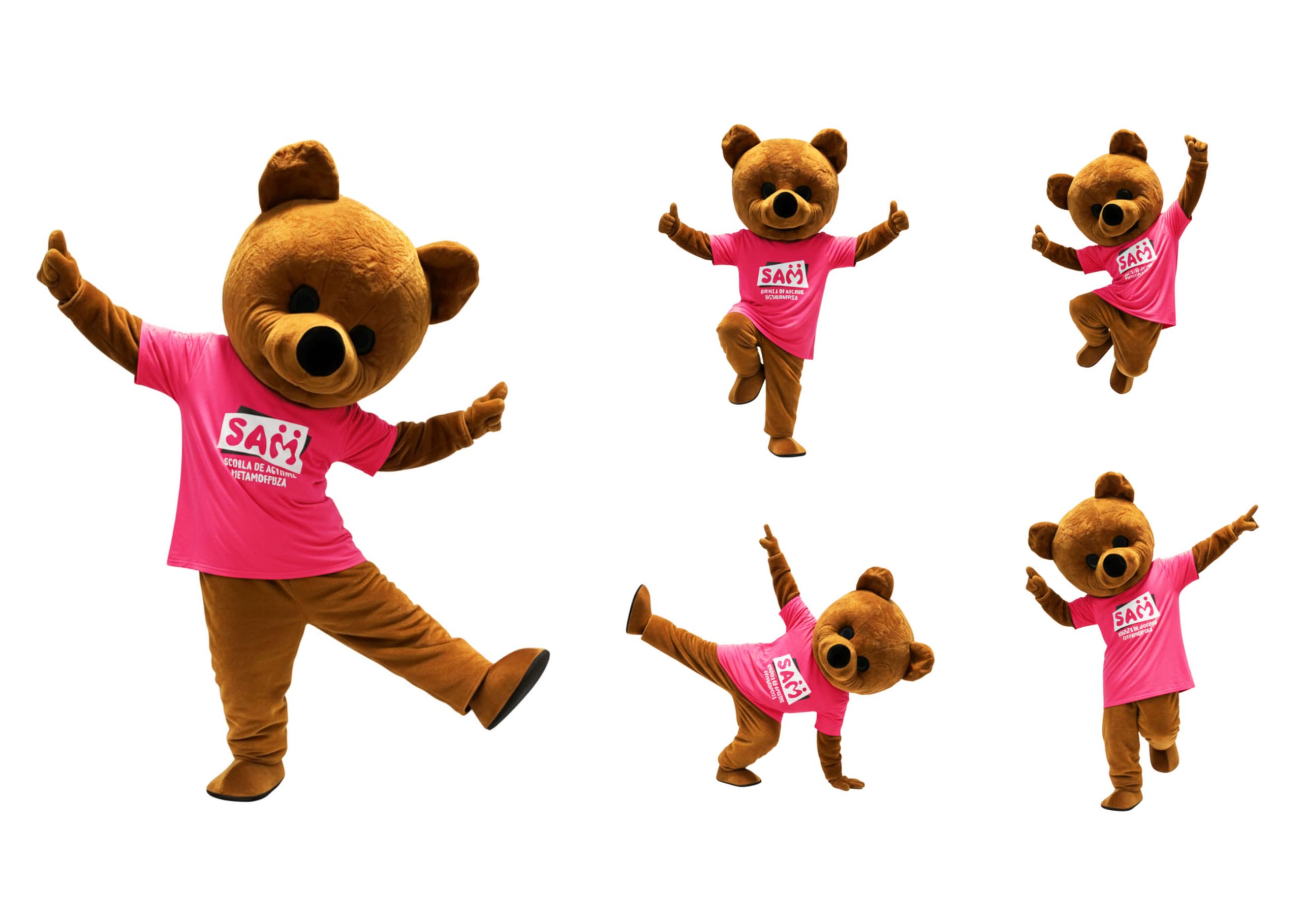
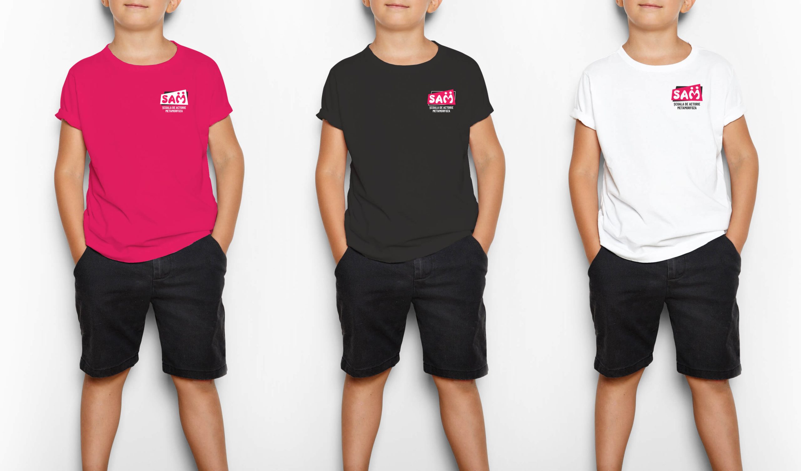
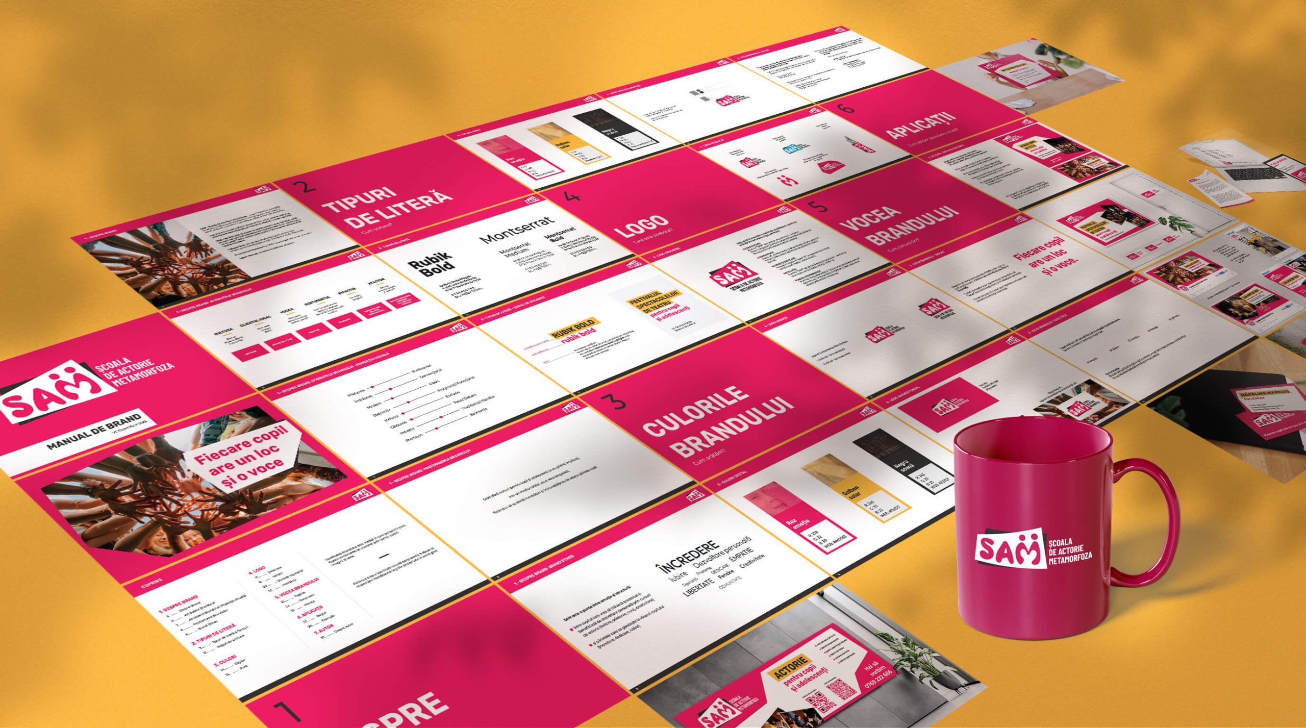
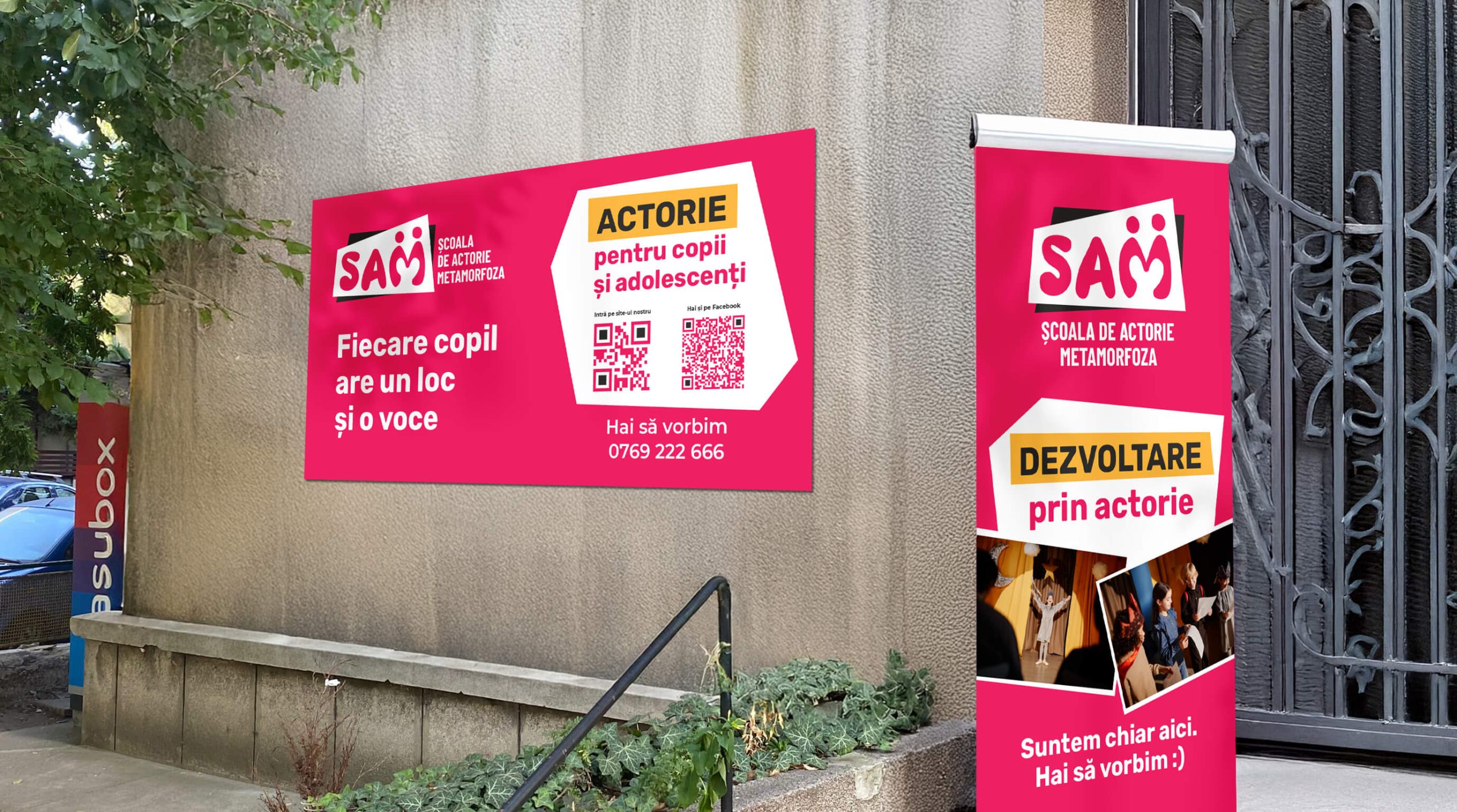
The visual identity expresses the energy of the stage, the emotion of childhood, and the safety of a well-guided environment. The visual system is bold, memorable, and easy to recognize in a category that is often predictable.
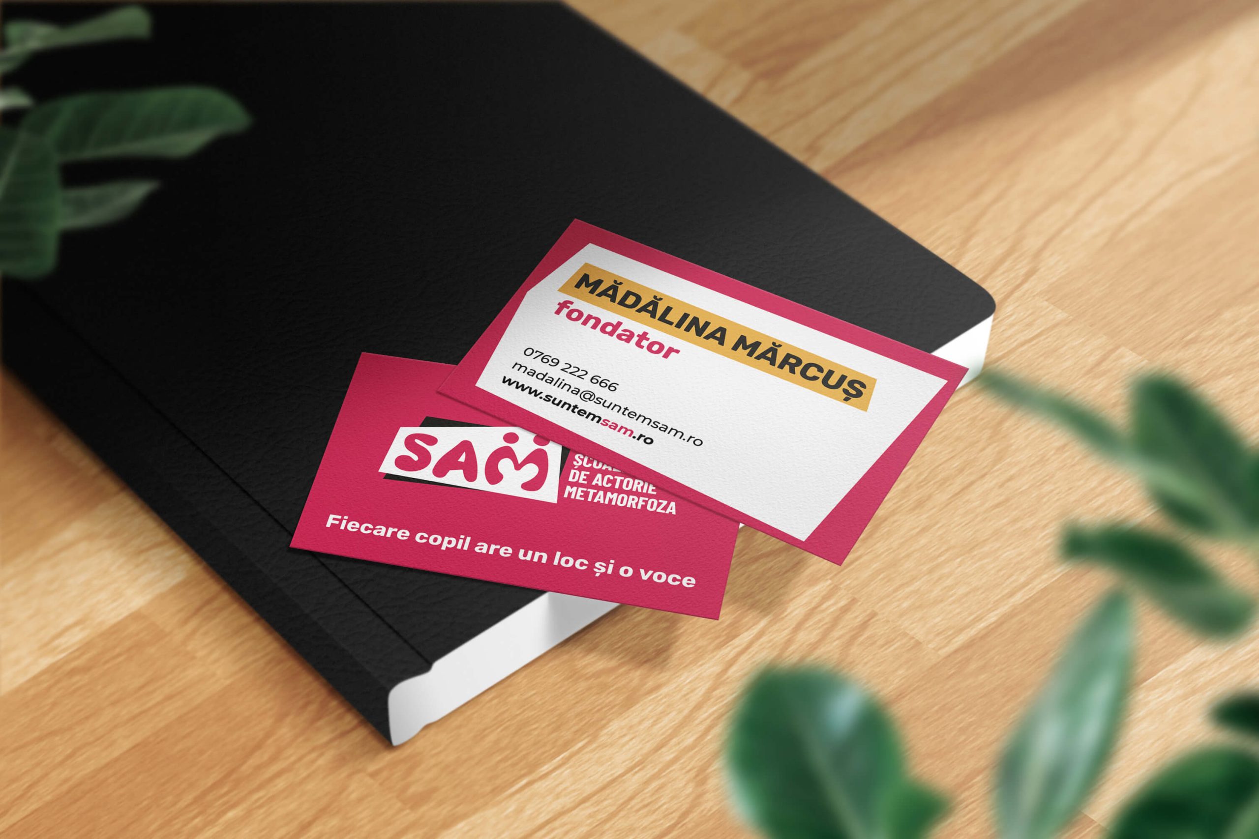
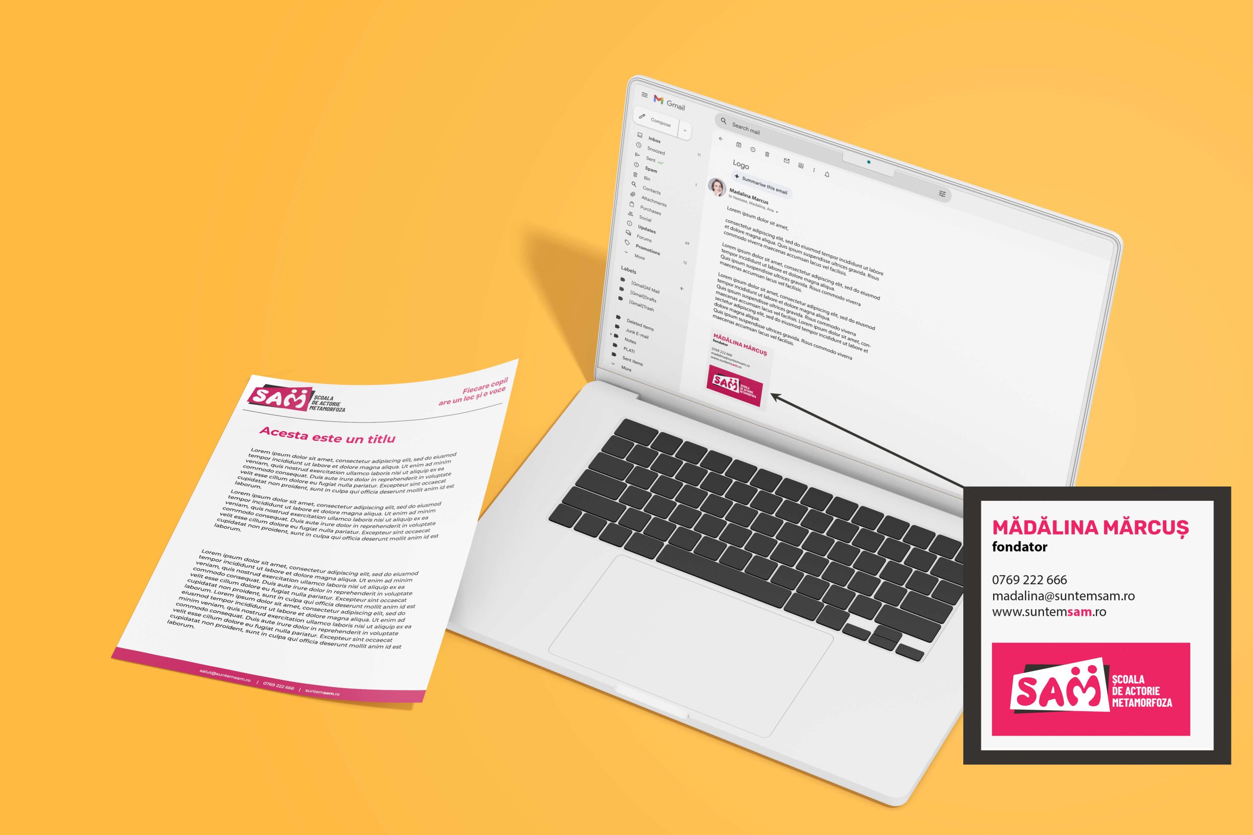
We chose a distinctive color palette built around Emotion Pink (expression and courage), Solar Yellow (energy, optimism, visibility), and Stage Black (contrast, depth, professionalism).
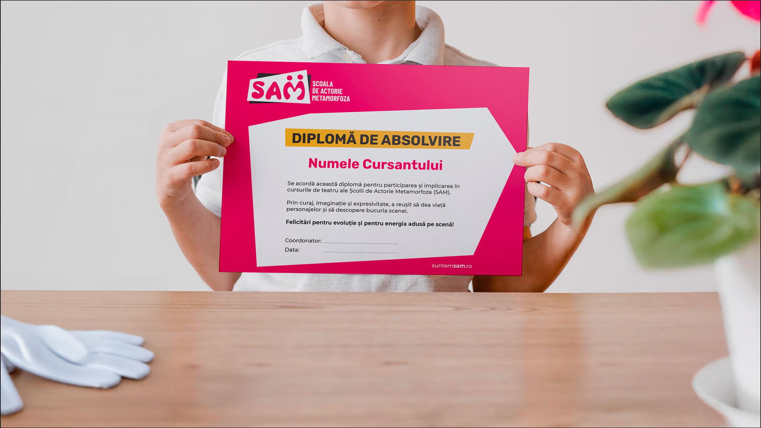
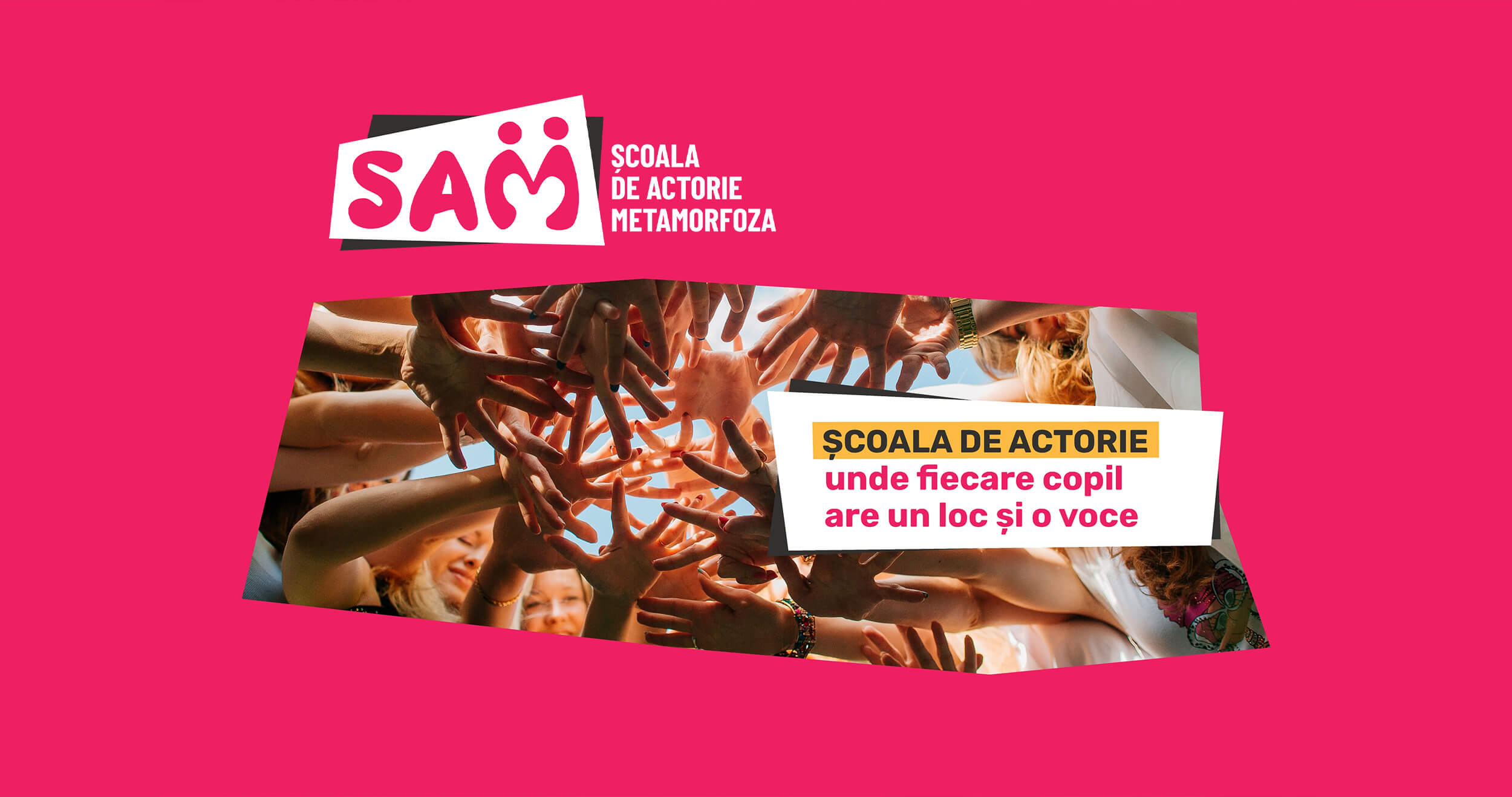
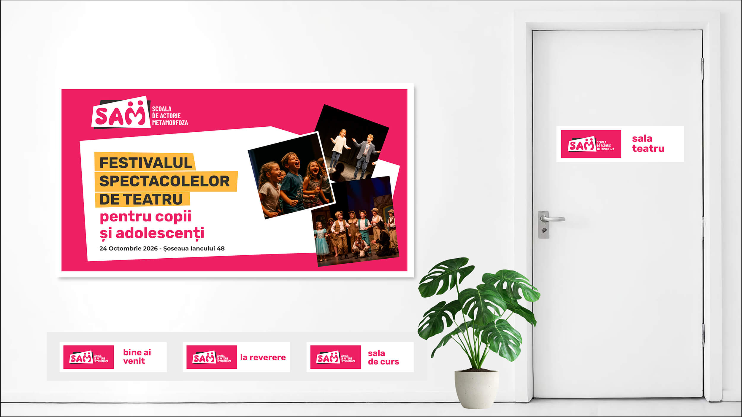
The core message, “Every child has a place and a voice.”, captures the brand promise: belonging, self-expression, and freedom. For imagery, we created graphic masks with cut-out shapes and irregular corners designed to convey creativity, freedom of expression, and energy. They act as the opposite of rigidness and convention, reflecting the vibrant and spontaneous nature of acting.
THE LOGO
The story behind the logo
The SAM logo expresses creativity, emotion, and personal growth through a playful, memorable, and professional identity.
Creativity
The name “SAM” is drawn in a cursive, fluid, and organic style, suggesting freedom of expression and artistic spontaneity.
Community
The letter “M” is reinterpreted as two human silhouettes, symbolizing the relationship between children, trainers, and team spirit.
Care and Dedication
Within the negative space of the letter “M,” a heart emerges, representing the warm, empathetic, and safe environment offered by the school.
Growth
The overlap of the two color layers suggests continuous transformation, progress, and the process of personal development.
Professionalism
The full name, “Metamorfoza Acting School,” written in clear and confident lettering, brings stability and credibility to the overall concept.