THE CHALLENGE
What problems are we solving with this branding project?
Sports Fields is one of the first Romanian businesses to offer complete services for natural, hybrid, and artificial sports fields. Over the years, the company’s experts have participated in numerous events, congresses, and specialized activities to stay up-to-date with the latest information and technologies in the field.
With over two decades of experience in the industry, the company has built and maintains the most important green field in the country: the National Arena.
The passion for sports and the commitment to having the best product on the market must be reflected in the brand’s image.
Moreover, the brand needs a visual identity that communicates internationally and shows the company’s concern for keeping up with new technologies and processes in the field.


THE SOLUTION
What is the best approach for the brand?
Innovation, durability, adaptivity.
After the brand value discovery session, we identified and established the following key aspects:
• Brand positioning
• Brand attributes
• Brand personality
• Visual directions
• Brand visual identity
• Brand slogan
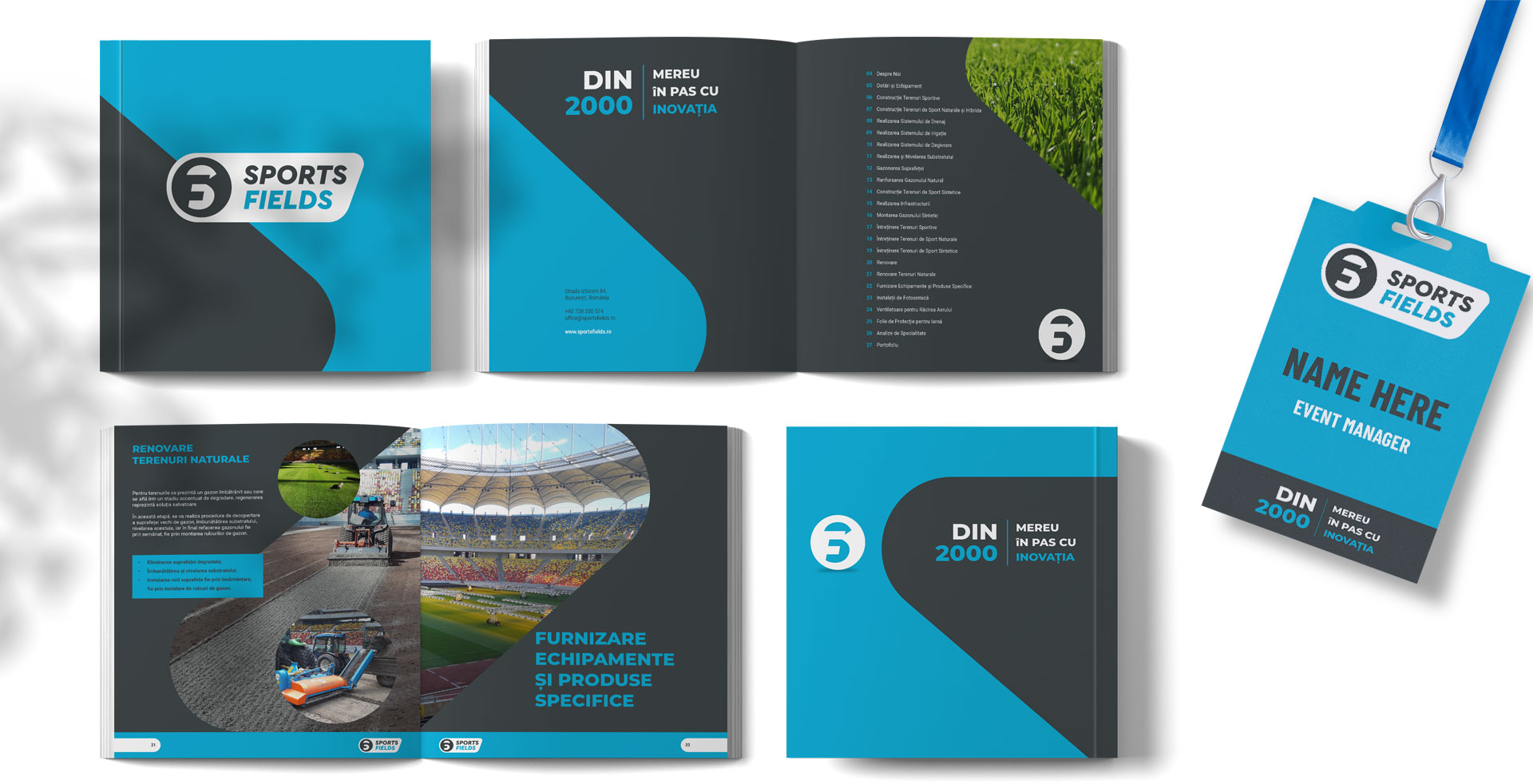
Sports Fields is a dynamic brand, and the colour blue gives it an energetic appearance, supported by oblique shapes that define its visual identity.
The harmony between straight and curved lines illustrates the brand’s professional attitude, as well as its friendly approach. The visual identity is innovative for this field of activity, embracing the brand slogan:


THE LOGO
The symbolism behind the logo.
The abstract symbol illustrates the innovation and competence of combining solutions for the complete services that the brand offers.
The combination of the two initials of the brand name, “S” and “F”, forms an optical illusion through the play with negative space.

The dynamic logo, achieved through the round shapes and diagonal arrangement of the text, suggests the proactive attitude of the company.


