THE CHALLENGE
What problems are we solving with this branding project?
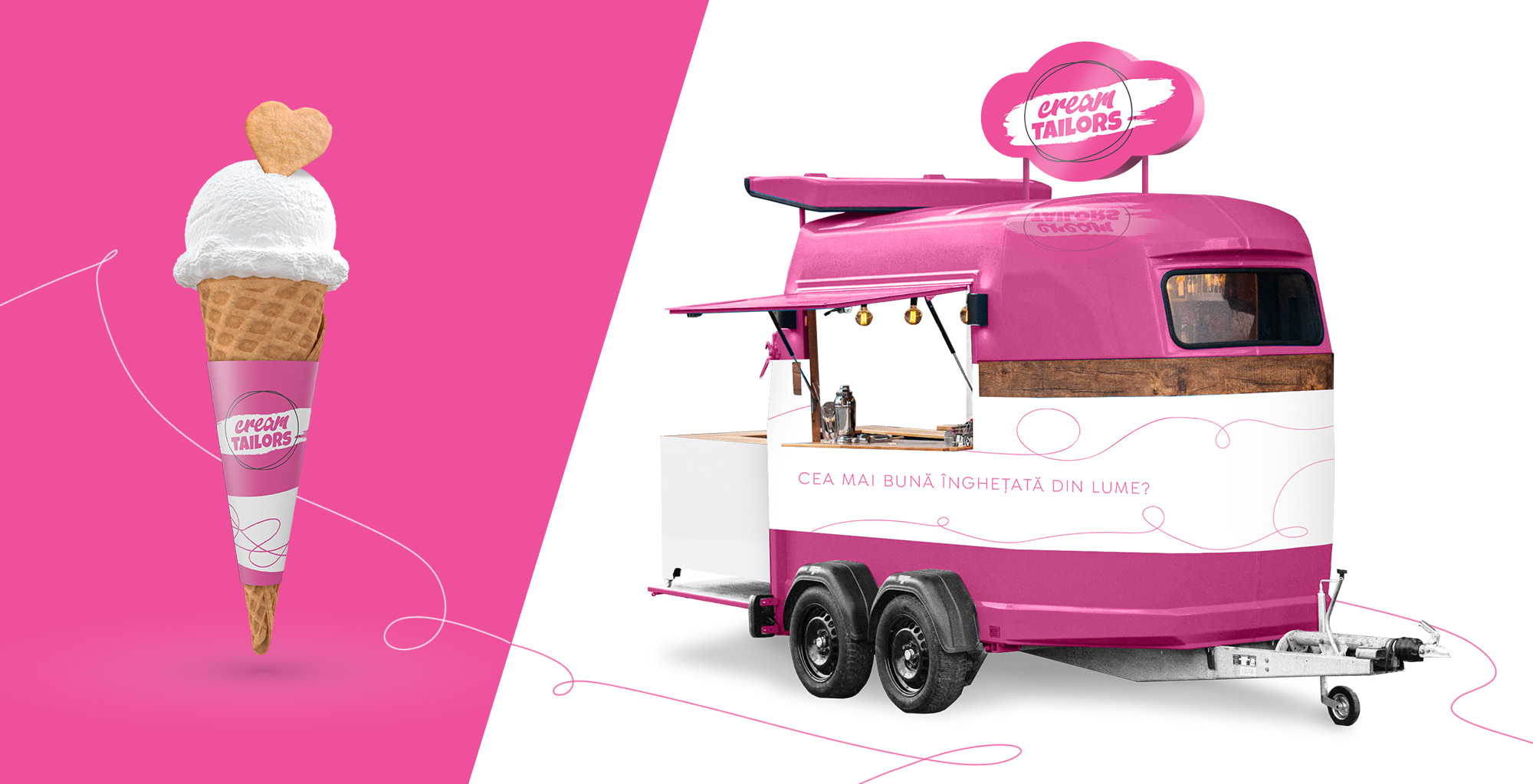
The brand was born out of a passion for delicious, high-quality ice cream. It’s not just any ice cream, it’s a super creamy ice cream that delights any taste bud, no matter how demanding. It’s ice cream that brings together all the beloved flavours, as well as new and unique flavours, bold and daring recipes.
The mission of the brand is to create the best ice cream in the world…for everyone.
We cater to a diverse audience in terms of age, culture, and nationality, but they all have one important thing in common: a love for delicious taste.
To differentiate ourselves from the competition, we need an innovative concept that represents the brand’s personality and creatively communicates its values: quality, good taste, delicious flavours, artisanal, and passion.

THE SOLUTION
What is the best approach for the brand?
Passion, creativity, non-conventional.
The name “Cream Tailors” perfectly captures the brand’s passion for creating ice cream recipes that cater to every taste, while also embodying its daring and adventurous spirit. Have you ever tasted ice cream infused with rosemary or lavender? With Cream Tailors, you can savour unique and innovative flavours that are truly a cut above the rest.
The entire visual concept is based on the idea of tailoring, with the thread and spools representing the diverse range of flavours and messages the brand has to offer.
The brand’s signature colour is a gentle and sweet shade of magenta that complements any ice cream flavour.
Each ice cream flavour is depicted through the actual ingredients that go into it, ensuring that every scoop is packed with the real and authentic taste of its ingredients. Cream Tailors takes pride in crafting ice cream that not only tastes great, but also looks visually stunning, making it an experience that engages all the senses.


THE LOGO
The symbolism behind the logo.
The logo design is a bold yet aesthetically pleasing combination of a cursive font with lowercase letters and a playful font with uppercase letters. The subtle heart hidden in the first “a” conveys the passion for ice cream. This heart element is subtly incorporated into all brand materials, including uniforms, napkins, labels, flavors, and even in the path of the thread.
In addition to the typographic logo, artisanal and creative elements have been added to the design, such as the thread and the trail of an artistic brush in the sweetest color possible. The result is a visual identity that perfectly captures the brand’s personality, representing both the artisanal nature of the ice cream and the creativity and passion that goes into each recipe.