THE CHALLENGE
What problems are we solving with this branding project?
Paleo Suisse is more than just a brand dedicated to paleo nutrition. It embodies the values of freedom, movement, health, and evolution. Its mission is to offer conscious individuals who think long-term the assurance that they have made a wise choice for both their health and the environment.
In recent years, the paleo diet has gained popularity, but like any food trend, there are also controversial aspects.
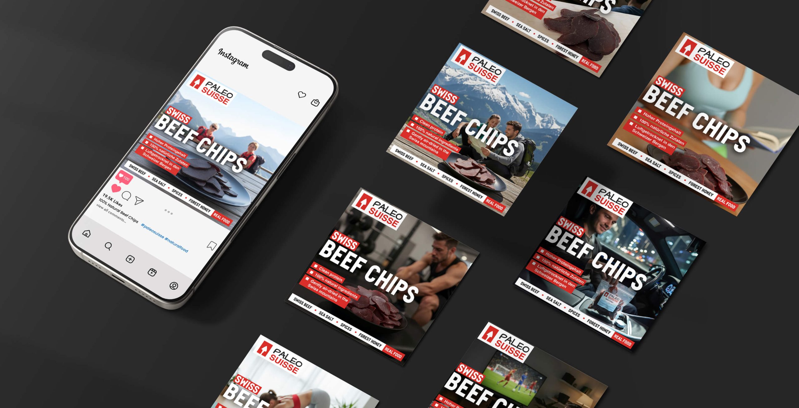
The brand wants to bring to the forefront a clean product based on paleo nutrition, which can help people when they need a meal that provides the necessary energy and nutrients. At the same time, it wants to be recognized as the first Swiss brand dedicated to the paleo diet and easily associated with Switzerland’s cultural identity.
The brand must effectively communicate the principles of the paleo diet and capture the attention of the target group that resonates with these principles, as well as with moral and social values related to responsible food consumption, environmental protection, and conscious and sustainable mentality.


THE SOLUTION
What is the best approach for the brand?
Swiss, purity, freedom.
The colour palette selected for the logo and packaging blends the specific colour of the Swiss flag with a nod to monochromatic cave paintings. The red hue also plays a crucial role by evoking the raw power of the hunter.
The font chosen for this product’s name is none other than “Helvetica”, which, coupled with “pemmican” (the Native American name for dried meat), creates a unique concept and an innovative merging of two distinct cultures.
Through the creative process, which included a comprehensive branding strategy, we identified the voice and tone that should be used to effectively communicate the brand’s messages to the target audience.
This brand is designed for conscious, active individuals who value freedom, love dynamic living, appreciate nature, and refuse to compromise on their diet or health.

THE LOGO
The symbolism behind the logo.
The logo is composed of the typographic form of the brand name alongside the symbol of a spearhead. The logo animation smoothly transitions from the Swiss flag to the spearhead, representing the hunting weapon of our Palaeolithic ancestors.
This showcases the harmonious union of ancestral traditions and contemporary values of Switzerland, such as quality, precision, and dedication.


