THE CHALLENGE
What problems are we solving with this branding project?
The challenge was to uncover what truly sits at the heart of 4x4PRO.
We started with the brand discovery workshop, followed by competitor research and our strategic process. We looked beyond what the brand sells to understand what it promises and how it should be perceived.
The direction began to take shape around a compelling balance: adventure and seriousness.
A strong passion for 4×4 and a professional, solution-driven mindset came together in a brand built to offer clear, technical and reliable answers.
Our challenge was to articulate this foundation and turn it into a coherent visual identity: bold enough for the off-road world, but grounded enough for a brand that needs to inspire safety, clarity and trust.
In short, we built a brand that says it simply: you bring the passion, 4x4PRO brings the solution.
The goal was to translate technical expertise into a robust visual presence. One that could stand out both in digital environments and in demanding, real-world applications, out in the field.
THE SOLUTION
What is the best approach for the brand?
The solution came from the strategic direction defined in the first stage: a brand built around the balance between passion, professionalism and support.
We developed an identity that carries the energy of the off-road world, while keeping the technical precision and trust customers need when looking for products and recommendations for their vehicles.
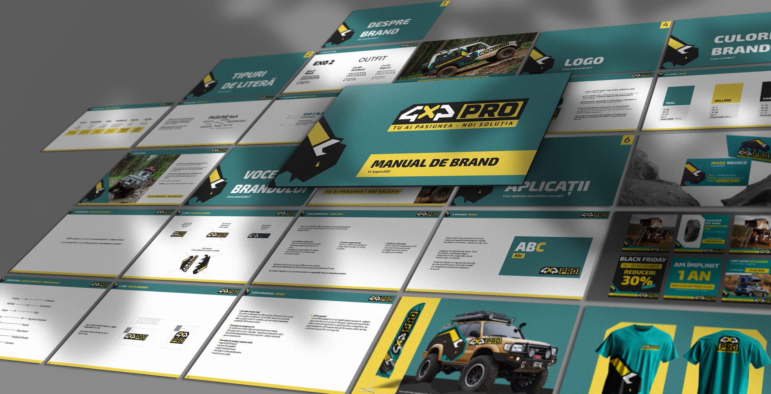
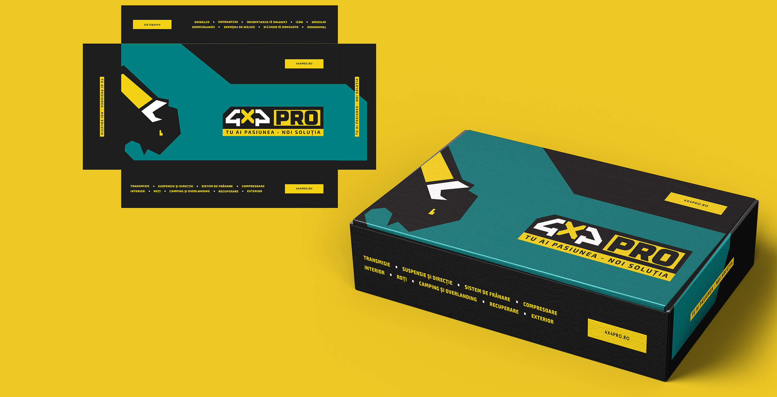
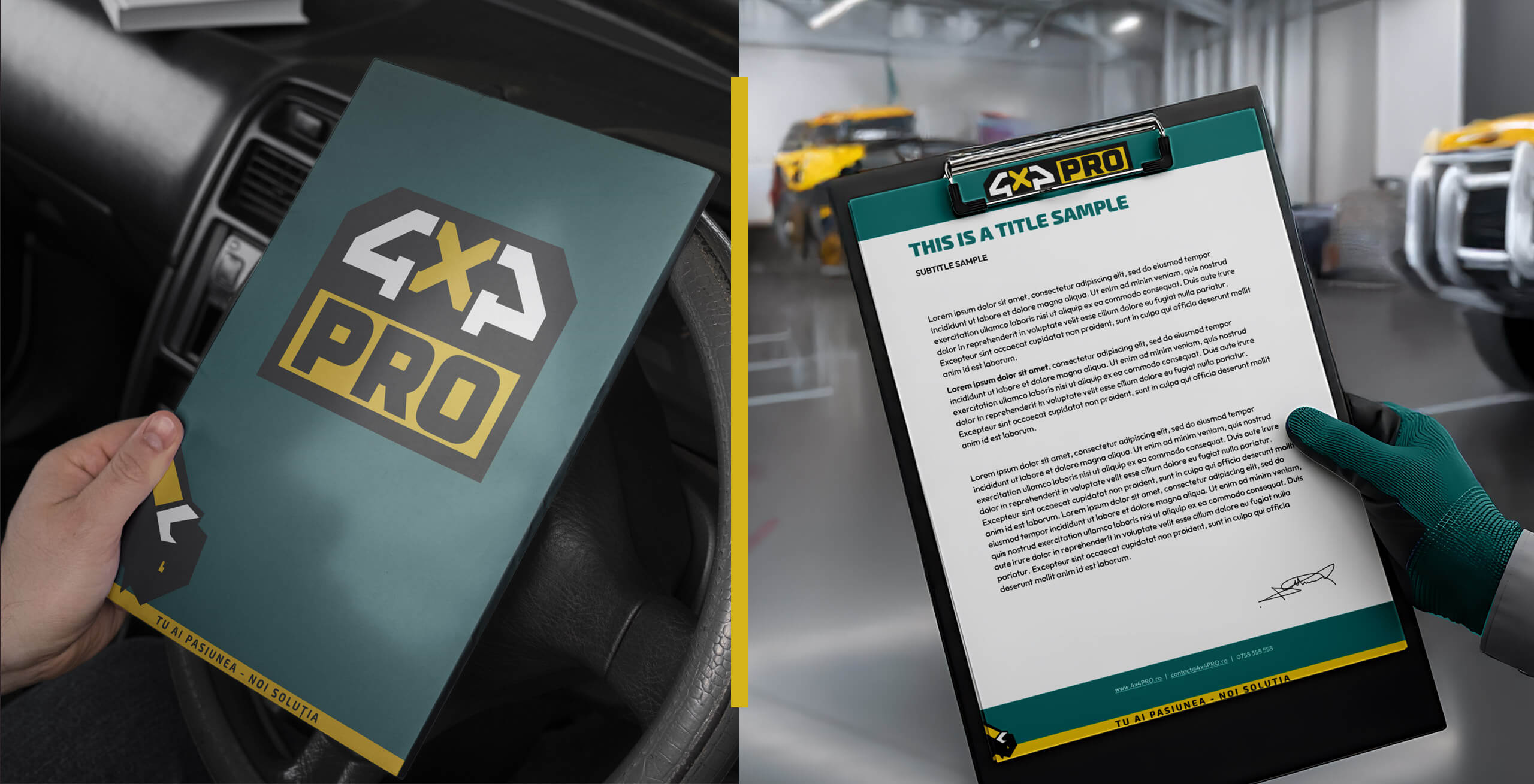
Color palette: We chose a modern palette built around Teal, as a symbol of balance, Yellow for energy and visibility, and Graphite for technical rigor.
Tagline: The central message, “You bring the passion – we bring the solution,” was integrated as a natural expression of the partnership between the brand and its customers.
Typography: Exo 2 Black gives the headlines strength and robustness, while the Outfit font family keeps paragraphs and technical details clear, readable and easy to navigate.
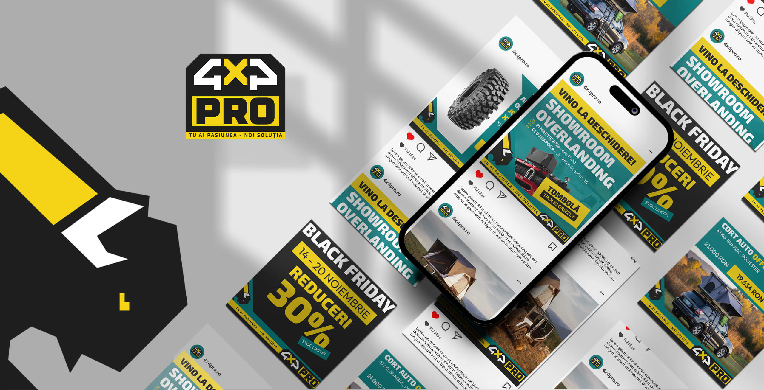
LOGO
The symbolism behind the logo
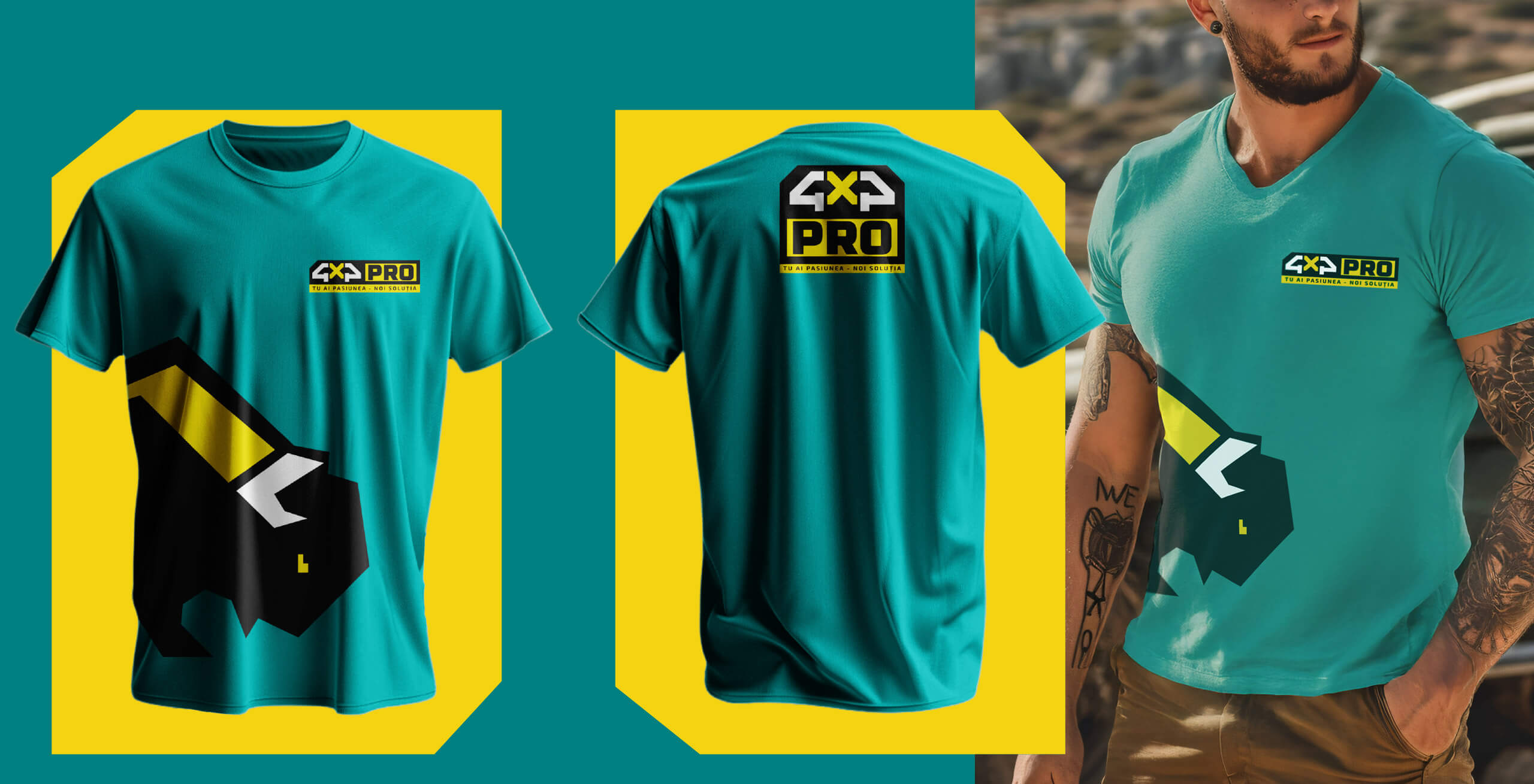
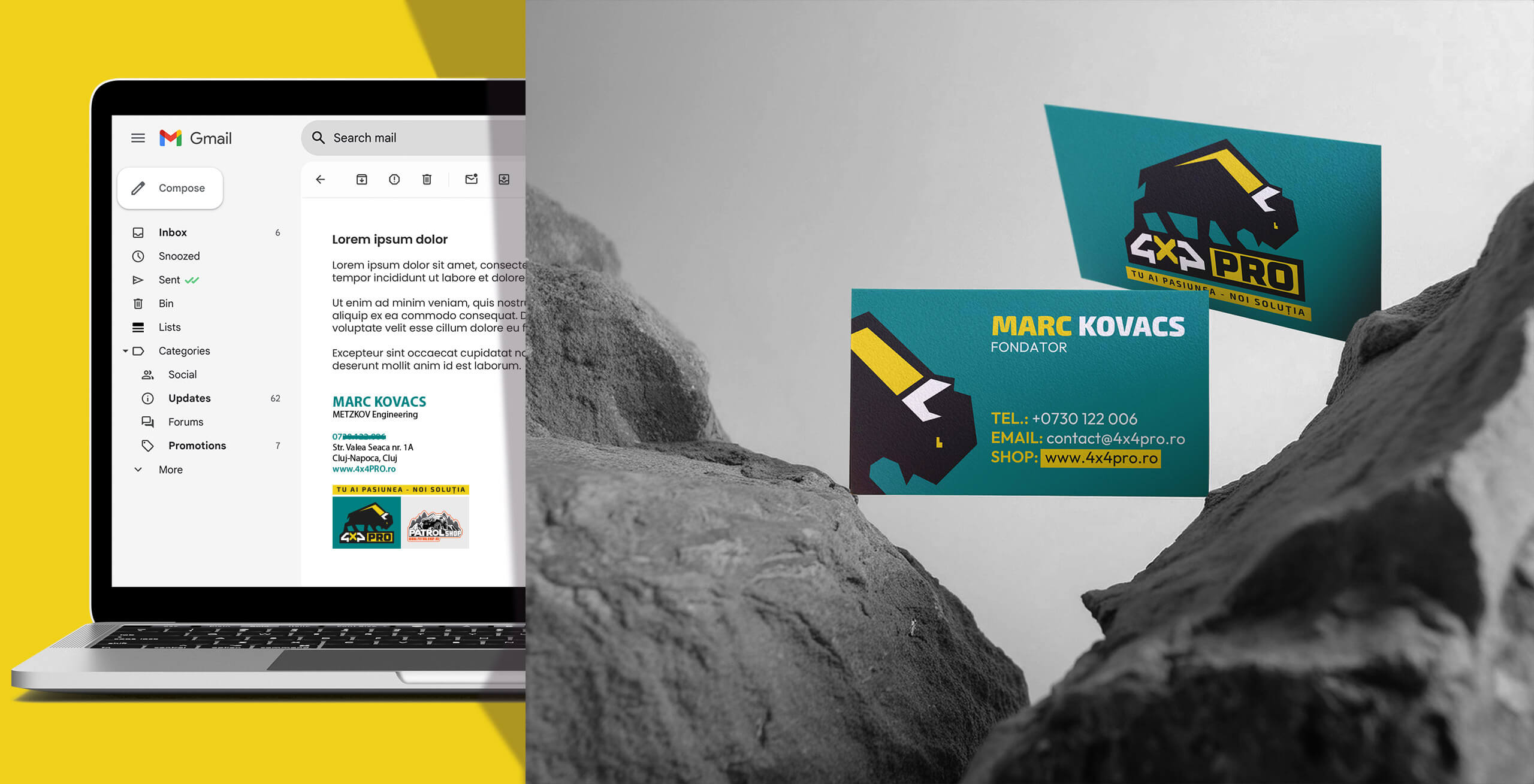
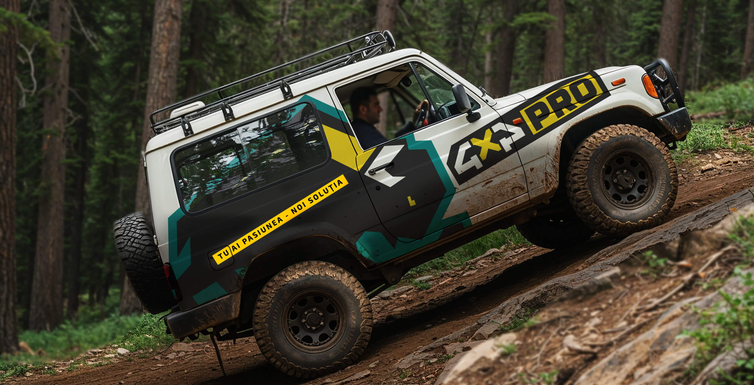
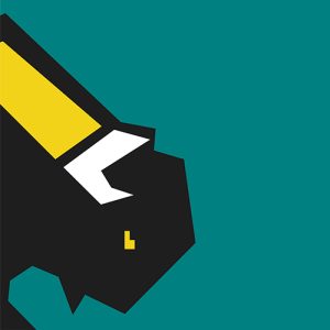
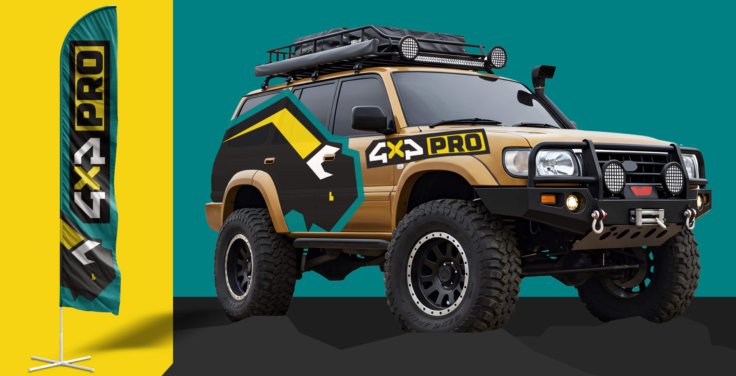
The central symbol of the brand is a stylized bison, chosen to visually communicate strength, resilience and an adventurous spirit. The logo is a composite mark, combining a robust typographic structure with a solid graphic element.
The composition was designed to be versatile: the horizontal version is used predominantly in visual layouts, while the bison symbol can function independently as a key visual.
A specific implementation rule was created for vehicle applications: on the left side of the vehicle, the bison symbol is mirrored so that it always faces the direction of travel. This reinforces the brand’s sense of movement and dynamism.